Biblia. 2 vols. Augsburg: Gunther Zainer, [not after 1474].
Morris wrote two extended commentaries on the book (quoted here from the Perry catalogue) on the flyleaf and some loose sheets of paper:
[Rough notes, with this comment, probably by Sydney Cockerell: “This note was not completed. A draft from an earlier note, on two small sheets, is laid in the volume, the following portions of which were not repeated on the flyleaf Note.”] “The historiated initials stand quite by themselves and are very interesting: the little subjects seem to be designed by Zeiner’s earliest artist, as he may be called, the draughtsman of the Golden Legend. They are good, though ruder than those of his second draughtsman, and tell the story well. The frame work of the letters is throughout very vigorous and highly decorative and logical in design; and altogether these initials must be amongst the best decoration of the early German printed books. The smaller initials are of Gunther Zeiner’s beautiful alphabet, and are used in most of his books. Their design is obviously an adaptation of the ornamental pen letters of this date. Big capitals in red occur throughout the book, and have the appearance of being stamped & not printed. ¶ The colouring has been at first good & judicious, and except for a little emerald green all done with transparent pigments; of which the lake is a particularly pleasant colour. The first initial (to Jerome’s letter) is painted extra carefully & has a very pretty illuminated ornament in the margin of it. ¶ This book has the stamp of the Buxheim monastery with which Gunther Zeiner was in close relation; and he is known to have presented a copy of this very book to it.”
[Note on flyleaf, dated January 1891] “This Augsburg bible printed by Gunther Zainer about 1474 does not seem to have received the attention which it deserves as a woodcut book. Apart from its type, which for a large book must be considered as the best of all black letter, it is a very remarkable book as a work of art. Its handsome ‘blooming letters’ are to be found in many Augsburg books and some printed at Ulm. They are translations in black and white of the illuminators’ pen letters current at the time and a little earlier; but which more or less kept up a still earlier tradition. Of all woodcut letters without figures, these of Gunther Zainer’s are the boldest and best designed, and add very much to the beauty of the books in which they appear. ¶ The third order of capitals which are all red and slightly floriated, are done in printer’s ink and seem to be stamped on the page after the printing: for their ink is uniformly bright, whereas the red printing at the heads of books is often sullied: since it was done at the same time as the black text by wiping away the black ink, and inking the type again with red—which being done insufficiently blackened the red in some cases almost to a brown. See Blades on this point. ¶ But the speciality of this bible is the series of historiated initials at the head of each book, which are so good and so ‘distinguished’ that they render it an important woodcut book. It is true that the figure work in them is inferior in drawing and general interest to the work of the designer of the cuts in the Aesop, the ‘de Claris Mulieribus’ or the Speculum Vitæ Humanæ: they are in fact rather illuminators’ pictures than woodcut designers’. The letters however are in general effect remarkably good; and, especially in the pattern-work, quite reach the high water-mark of 15th century design, and I consider them on the whole the best historiated Capitals of the period. ¶ These letters in this copy are coloured; and it would seem that this was done before it left the bookseller’s shelf; if it was not done in the printer’s workshop. The copy at the Brit: Mus: [British Museum] is coloured systematically just as this is; except that in this copy some one has come after the first colourist with a vermillion brush (vermillion is not used in the original systematic colouring) and has added that strong colour in some of the letters, by no means to their improvement; though, I take it, this blunder was was committed soon after the volume left the printer’s. For the rest I think an unprejudiced person will think that the colouring of the pre-vermillion very much improves the letters; this can easily be tested by reference to one initial, that of the Psalter, which has somehow been left uncoloured. ¶ I give as excellent examples of these letters the following: [. . .]”
Provenance: Carthusian monastery at Buxheim, Germany (presentation copy from Zainer). — Morris (acquired by January 1891). — Richard Bennett. — Sotheby 1898, lot 180 (sold to Quaritch for £80). — Marsden Perry. — Perry sale, American Art Association, 11 March 1956, lot 32. — John Saks. — Christie (New York), 1 October 1980, lot 78 (sold for $60,000). — Harry Ransom Center, University of Texas (Incun 1475 B471z).
References: Ellis valuation, fol. 2b, no. 22 (£80). — ISTC (ib00627000). — Marsden Perry List, pp. 33–34.
Digital version: BSB (vol. 1; vol. 2).

BSB
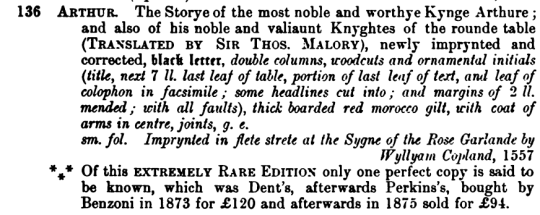
Sotheby 1898:







February 5, 2022
0 Comments